Predicta
An AI chat app that opens by listing what it cannot do, drawn in both themes on a five colour system.

A mobile app built on a language model: you ask in plain words and it writes back. The design work in that category is not the answer, it is everything around it. What is this thing, what is it allowed to be wrong about, and what can a person do when it is.
- Year
- 2025
- Role
- Product design
- Scope
- Design concept, both themes
- System
- Rubik, five colours, four grids
Theproblem
A chat window is the easiest interface to draw and the hardest to trust. One field and no edges: nothing on the screen says where the knowledge stops, whether the answer can be argued with, or what happens to it once it has been written. People either take everything it says at face value or stop opening it after a week, and both of those are design outcomes rather than model outcomes.
WhatIdid
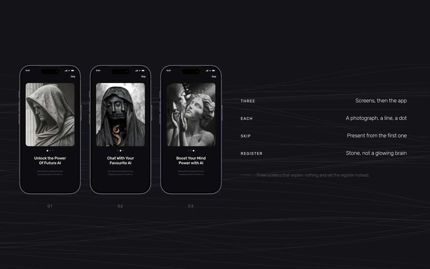
An onboarding that sets a register, not a feature list
The onboarding does not describe the model or list features. It is three photographs of sculpture, a line each, and Skip in the corner from the very first screen. What it buys is register: this is not another product with a glowing brain on the first screen, and a person who saw it once recognises the app later.
The first screen inside is a list of things it cannot do
The empty chat does not sell the model. It carries five cards, and only two of them are features: it remembers what was said earlier, and it takes corrections. The other three are admissions. It knows nothing about the world after 2021, it can generate incorrect information, and it can produce harmful or biased content. Putting that on the screen somebody meets first costs nothing and changes how they read every answer after it.
The answer is written in front of you, and can be stopped
Text arrives as it is produced rather than landing whole, so a wrong turn is visible three words in instead of after a paragraph. Stop generating sits under the thread while it runs, and the same place offers Regenerate once it is done. One control in one spot, because interrupting and retrying are the same kind of act.
The correction goes where the mistake is
A question can be edited in the line where it sits, and Save and Submit replaces the answer underneath it. Asking again at the bottom of the thread would be easier to build and worse to live with: it leaves two answers on the screen and no way to tell which one the person actually settled on.
A blank field is not a starting point
The assistant screen files written prompts under the job somebody came to do: hashtags for a video, channels on Telegram, a note about a medicine. Four categories across the top narrow the list. Nobody has to invent the first sentence, which is where products in this shape usually lose people.
Four ways in, and a form for people who trust none of them
Google, X, Apple and Telegram sit above the fold, and under them the ordinary email and password. Every field exists three times over: empty, focused, filled. The password never reveals itself, and the eye that shows it is part of the field rather than a setting somewhere else.
Four rows in the profile, and one of them is measured
Preferences, Account Security, Customer Support, Logout. Security carries a bar as well as the word Excellent, because the word on its own is the app marking its own homework and the bar is something a person can disagree with and go act on. Logout comes last and has no chevron, since it does not lead anywhere.
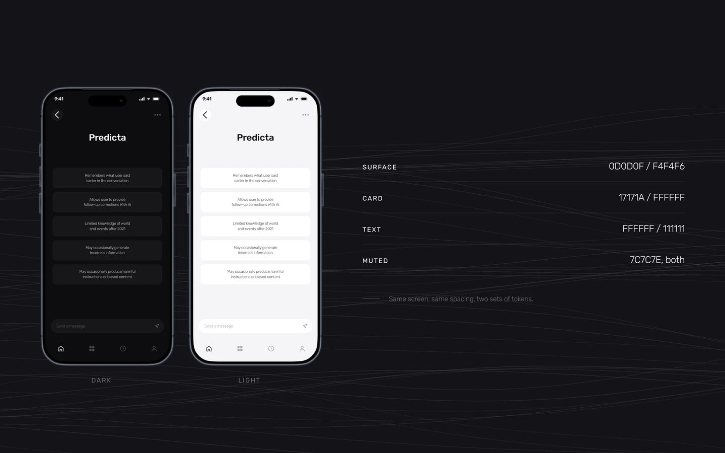
Both themes, drawn at the same time
Dark and light were not a retrofit. Every screen exists in both, down to the state of each field. The surfaces swap, the spacing never moves, and the muted grey is the one value that holds across the two so secondary text does not need a second decision.
Underthehood
The whole system fits on one board
Five type sizes, all at 120 percent leading and minus two percent tracking. Five colours. Four device widths from 320 to 440. One icon weight. A system this small is one person can hold in their head while drawing the whole app, and that is the reason the screens agree with each other.
Two of the five sizes are the same size
H4 and H5 are both 18 pixels and differ only in weight, Regular against Light. That is deliberate. The step between a label and the line explaining it is a change of weight and colour rather than of size, so a dense screen keeps one rhythm instead of stacking six of them.
States belong to the component, not to a later pass
Empty, focused and filled were drawn for every field before any screen was assembled, and then again for the second theme. That is six drawings of one text input. It is also the difference between a file somebody can build from and a file somebody has to ask questions about.
The mark is constructed rather than drawn
Four blades around a dot, built on a grid, so the arms match and the counter in the middle holds its size at every scale it appears: the app icon, the sign-in header, and the small square beside each answer in the thread.