Petfinder
An app for the hour after an animal goes missing, and for the stranger who finds it.
Two people, two situations that look identical on a screen and are nothing alike. One has lost an animal and is standing outside in the dark. The other is holding somebody else’s cat and does not know what to do with it. The app has to serve both without asking either of them to work out which half of it they are in.
- Year
- 2025
- Role
- Product design
- Scope
- Design concept, full flow
- System
- Rubik, one accent colour
Theproblem
A missing animal is an emergency with a deadline, and the tools people reach for are a lamp post and a local chat. Both are read by whoever happens to walk or scroll past in the first hour, and after that the notice is gone. The design problem is not the listing. It is the state of the person filling it in: upset, outdoors, holding a phone in one hand.
WhatIdid
Four doors, and no navigation to read
The home screen is two verbs for the person with a problem and two for the person who wants to help: Lost pets, Find pets, and the two browse screens under them. Under that, the board of the ones still missing. Anybody arriving in a hurry can hit the right half of the screen without reading a word of navigation.
The report is a conversation, not a form
It opens on "Hi, What happened?" and two buttons. After that it is one question per screen: which kind of animal, picked as five circles rather than a dropdown, then the name, then when, then the photo. Nothing on any screen needs a second hand or a steady head, and the flow ends on the finished card rather than on a confirmation that something was submitted.
The other half starts on the same screen
Somebody holding a cat that is not theirs gets the same question and the same two buttons, and then a flow that asks for the only two things a stranger can give: where, and a photograph. It never asks for a name or a date of disappearance, because they could not possibly know either. Two taps and a picture, and the animal is on the board.
The camera is part of the report
The photograph is taken inside the app rather than fetched from a camera roll, so it arrives already attached to the post and nobody has to remember to come back and add it. The framing grid earns its place here: it is what gets the whole animal into the shot instead of a blurred corner of one. On somebody else’s phone, the same tap becomes the only notification this product ever sends.
The notice is built for the stranger, not the owner
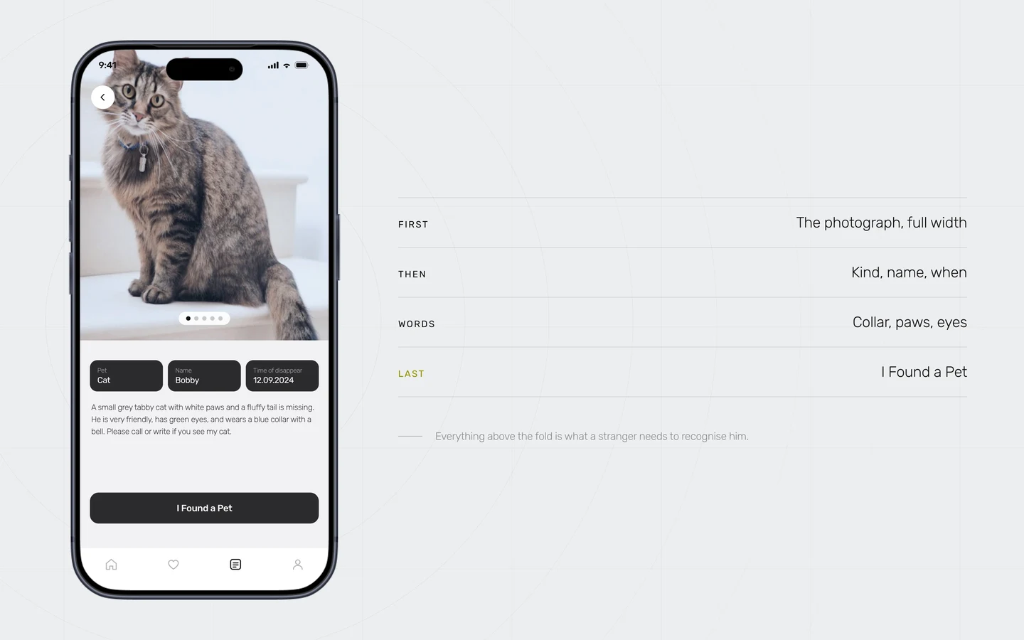
The photograph takes the whole top of the screen, because recognition happens there or not at all. Under it three facts, then the description in the words that actually identify an animal: white paws, green eyes, a blue collar with a bell. The last thing on the card is I Found a Pet, so somebody who recognises him never has to go hunting for how to say so.
Search takes the words a person actually has
Nobody looking for an animal knows its breed. They know it was grey, that it had a blue collar, and roughly where. So the field takes a description rather than a taxonomy, the filters sit under it instead of behind a button, and results come back from both halves of the app at once. If somebody has a photograph instead of words, the same search runs from that.
One exchange, and a screen for the end of it
The chat between the finder and the owner is the part that resolves a search, and it usually takes six messages: I think I found her, where did you see her, does she have a collar with a bell. The screen after it is the one most apps in this category never draw. It does not say the post was closed. It says you helped find Bobby, and it credits the stranger rather than the product.
Underthehood
One accent colour, with a rule attached
Rubik, three greys, black, and a single acid yellow. The yellow is reserved for whatever is happening right now: the option just chosen, the step you are on, the tick at the end. Because it never decorates anything, it can carry an interface this white without a second accent turning up to help.
The two halves are symmetrical on purpose
Lost and found are the same flow with the labels swapped, which means one set of screens covers both and there is no second-class path for the person doing the good deed. It also means the found half is never the one that got less attention, which is how these apps usually fail: they are built for the owner and the finder gets a contact form.
Photography is the interface
Every screen that matters is a photograph with a small amount of type on it. That is a decision about identification rather than about style: nobody recognises an animal from a breed field, and the drawings and icon sets these apps are fond of get in the way of the only thing on the screen doing real work.
The states nobody demos are drawn
The password field exists empty, filled, and wrong in red. Recovery has both routes, the four digit code, and the new password after it. These are the screens somebody meets on the worst evening of their week, and leaving them until later is how a flow that demos well falls apart the first time it is used in anger.